6 Diagnostic Measures I
6.1 Model Conditions
- linear relationship
- constant variance
- independent errors
- normal errors
- no outliers (that’s part of the normality condition)
Notes:
- There are no required conditions about the explanatory / predictor variable.
- If the explanatory variable is binary, SLR becomes the two-sided t-test.
Remember, \(x_i\) are constants, so we don’t think of them as having a distribution. Also, we are allowed to construct whatever \(x_i\) we want. That said,
- A larger range of \(x_i\) will produce less variable predictions.
- However, outliers in the x-direction can be very influential.
6.1.1 Residuals
\[\begin{eqnarray*} \mbox{residual: } e_i &=& Y_i - \hat{Y}_i \ \ \ \mbox{we can measure}\\ \mbox{error term: } \epsilon_i &=& Y_i - E[Y_i] \ \ \ \mbox{we cannot measure} \end{eqnarray*}\]
mean: \(\overline{e} = 0\) (by definition!). Therefore, the average of the residuals provides no information about whether \(E[\epsilon]=0\).
(note: \(\sum e_i = \sum(Y_i - b_0 - b_1 x_i) = 0\) because \(\frac{\delta Q}{\delta \beta_0} = 0\).)
variance: \[s^2 = \frac{1}{(n-2)} \sum (Y_i - \hat{Y}_i)^2 = \frac{1}{(n-2)} \sum (e_i)^2 = \frac{1}{(n-2)} \sum (e_i - \overline{e})^2 = \frac{SSE}{(n-2)} = MSE\]
non-independent: because \(\sum e_i=0\), the residuals are not independent. It is the \(\epsilon_i\), errors, we assume to be independent.
6.2 Diagnostic Plots of Residuals
[1] Plots of residuals vs. predictor variables / explanatory variables.
[3] Plots of residuals vs. fitted values.
[6] Box plot (histogram) of residuals.
What do I do if the plots show that the conditions don’t hold??
1. Abandon regression model and use something more appropriate. If you are interested in the coefficients: nonparametrics, time series, random forests. If you are only interested in prediction, maybe it is okay that the conditions don’t hold? But maybe not (e.g., independence is key!). Other prediction models include: random forests, support vector machines, neural networks, loess (smoothing).
2. Transform the variables so that the model does hold.
Violating Linearity
You see: a pattern to the scatterplot that isn’t linear
You do:
- include a \(x^2\) term or other function of \(x\).
- you can linearize a non-linear function, but the interpretation can get complicated.
Violating Constant Errors
You see:
- typically we see errors increase as \(x\) increases (which is sometimes easier to see with the absolute value of the residuals).
- not a hugely serious problem (we have less efficient estimates, and our variance estimates are not correct)
You do:
- direct approach is to use weighted least squares (we won’t talk about this)
- often transformations stabilize variance
Violating Independent Errors
You see:
- typically due to another variable (time, geographic location, etc.)
- residual should be plotted against that variable.
You do:
- work with a model that accounts for a correlated error structure (e.g., time series)
Violating Normal Errors
You see:
- residual plots that are not symmetric
- very general empirical rule: \(68\% \pm \sqrt{MSE}\), \(95\% \pm 2\sqrt{MSE}\) (only concerned if grossly different)
- we won’t cover normal probability plots (also called q-q plots)
You do:
- non-normality and non-constant variance are often related, and transformations will typically fix both.
Having Outliers
You see:
- typically easiest to see with standardized or studentized residuals
- SLR is not resistant to outliers
- we expect about 95% of studentized residuals to be within \(\pm 2\).
You do:
- outliers can seriously deform the least squares estimate. If there is a good reason to keep the value(s), we might consider a nonparametric method which places less weight on such a point.
Why do we plot resid vs. fitted and not vs. observed?
We know that \(e_i\) and \(\hat{Y}_i\) are uncorrelated (this can be shown using linear algebra, also note that \(\sum e_i \hat{Y}_i = 0\)). So, if we go from the resid vs. fitted scatterplot to the resid vs. observed scatter plot, we shift each point in the x-direction (only) by an amount equal to the residual. If the residual is negative, then the point will shift to the left. If the residual is positive, then the point will shift to the right. We thus create a positively correlated relationship (between resid and observed). The degree of the shift will depend on the relative magnitudes of the residuals and predicted values.
\(\Rightarrow e_i \mbox{ and } Y_i\) are correlated and therefore not independent. Consider the two examples below. In both examples, the residual is correlated with the response variable. However, it is easier to see the correlation when the residual is not also responsible for the relationship between the response variable and the explanatory variable.
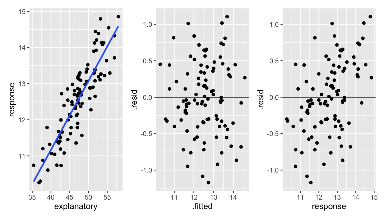
Figure 1.3: With correlated data, it is hard to see the dependence between the response variable and the residuals. However, a careful look at the third plot shows that there is a slightly stronger correlating between the response variable and the residuals than there is between the fitted values and the residuals.
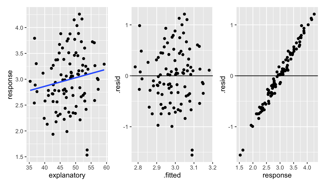
Figure 1.4: With uncorrelated data, it is much easier to see the dependence between the response variable and the residuals.
6.3 Transformations
Important note!! The idea behind transformations is to make the model as appropriate as possible for the data at hand. We want to find the correct linear model; we want our conditions to hold. We are not trying to find the most significant model or big \(R^2\).
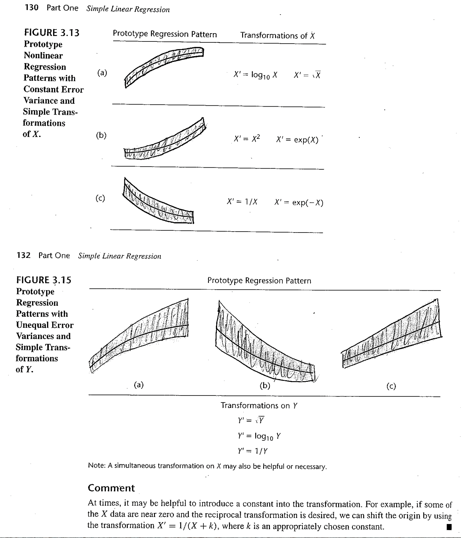
Figure 6.1: Taken from Applied Linear Statistical Models, 5th ed. by Kutner et al. Figures 3.13 and 3.15.
6.4 Correcting Condition Violations
If we noticed a non-linear relationship, we could certainly think to fit a non-linear trend line. At the same time, we might consider fitting an exponential relationship, or some other functional form. What we do is still called linear regression, but we transform the data so that the we are fitting a linear model between \(f(y)\) and \(g(x)\). This way, our techniques and theory still follow, least squares etc. For instance, we might think of fitting a linear relationship to the new variables \(y^*=\sqrt{y}\) and \(x\), or possibly \(y\) and \(x^*=x^2\). Occasionally, we might think of transforming both variables. One general rule is as follows:
- If your initial fit shows a violation of the linear condition only, then it is best to transform \(x\).
- If your initial fit shows a violation of the linear condition as well as normality issues or heteroscedasticity, then a transform of \(y\) should be considered. There will hopefully be a transformation which will correct both problems at once.
- That is, changing \(x\) changes the shape of the relationship. Changing \(Y\) changes the error structure (and also often the shape).
Note: Formal testing for violations of model conditions is usually not a good idea. Why? Multiple testing problems arise (extra type I errors); additional tests are typically very sensitive to their own technical conditions; and we lose power to detect the differences of interest.
6.4.1 GDP Example
Consider the following data which was collected by The World Bank in 20201. The data include GDP and % Urban Population. A description of the variables as defined by The World Bank are provided below.2
GDP: “GDP per capita is gross domestic product divided by midyear population. GDP is the sum of gross value added by all resident producers in the economy plus any product taxes and minus any subsidies not included in the value of the products. It is calculated without making deductions for depreciation of fabricated assets or for depletion and degradation of natural resources. Data are in current U.S. dollars.”
Urban Population (% of total): “Urban population refers to people living in urban areas as defined by national statistical offices. It is calculated using World Bank population estimates and urban ratios from the United Nations World Urbanization Prospects.”
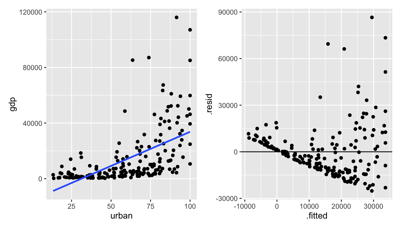
Figure 6.2: It seems as though the original data don’t meet the LINE conditions needed for inference in a linear model.
Let’s try to transform the variables to get a model which seems to conform to the LINE technical conditions.
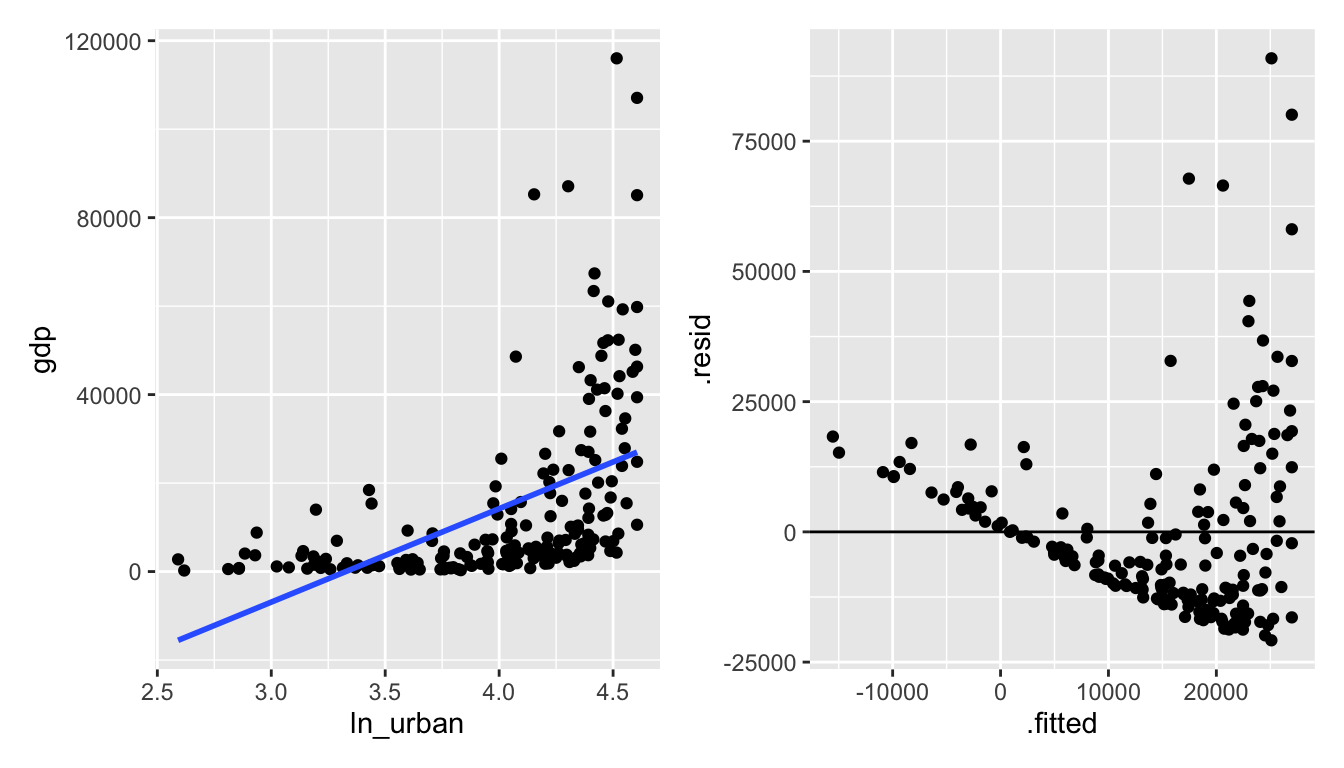
Figure 6.3: ln(urban) vs gdp: seems like taking the natural log of urban makes the relationship worse.
Alas, it really seems like the gdp variable is more of the problem than the urban variable. Let’s transform gdp instead.
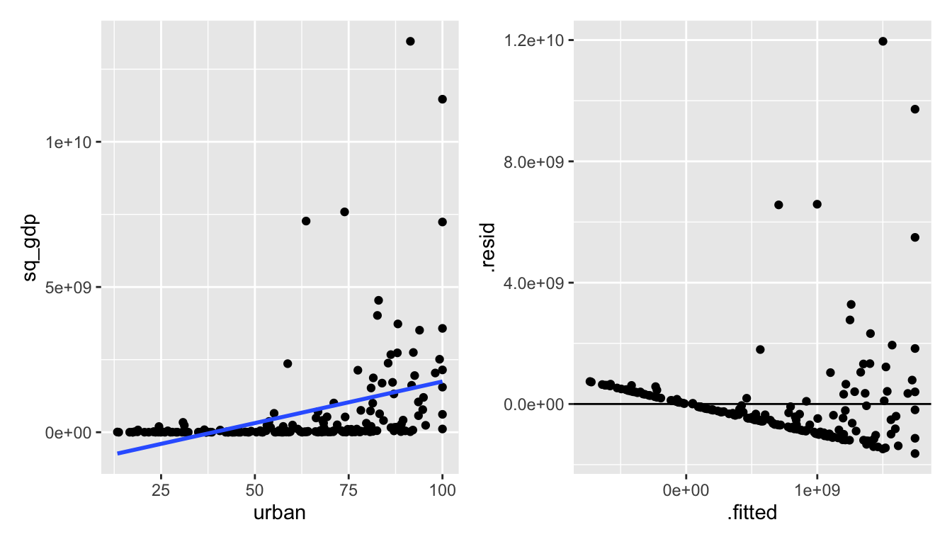
Figure 1.5: urban vs gdp^2: squaring gdp also makes the relationship worse.
The needed transformation should spread out the small gdp values and shrink the large gdp values.
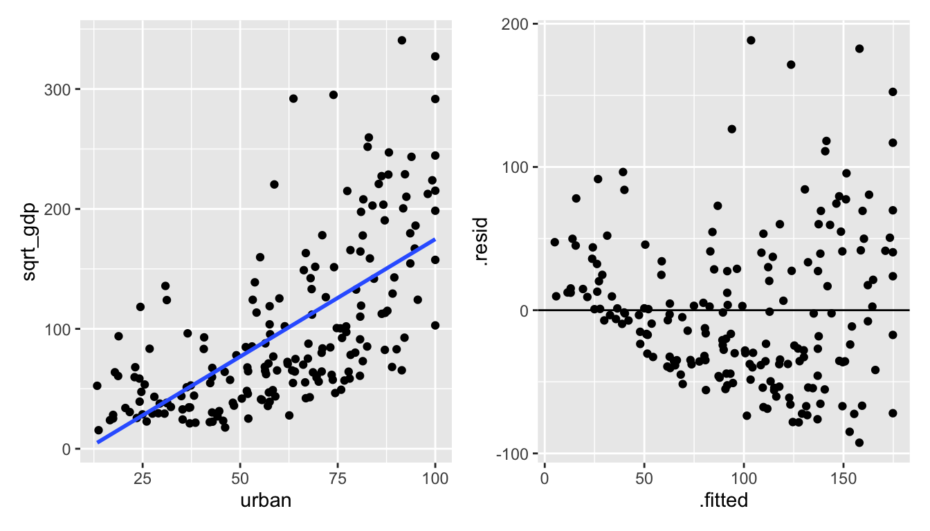
Figure 1.6: urban vs sqrt(gdp): the square root of gdp seems to help!
The natural log is a stronger function than the square root (that is, it will shrink large values even more.).
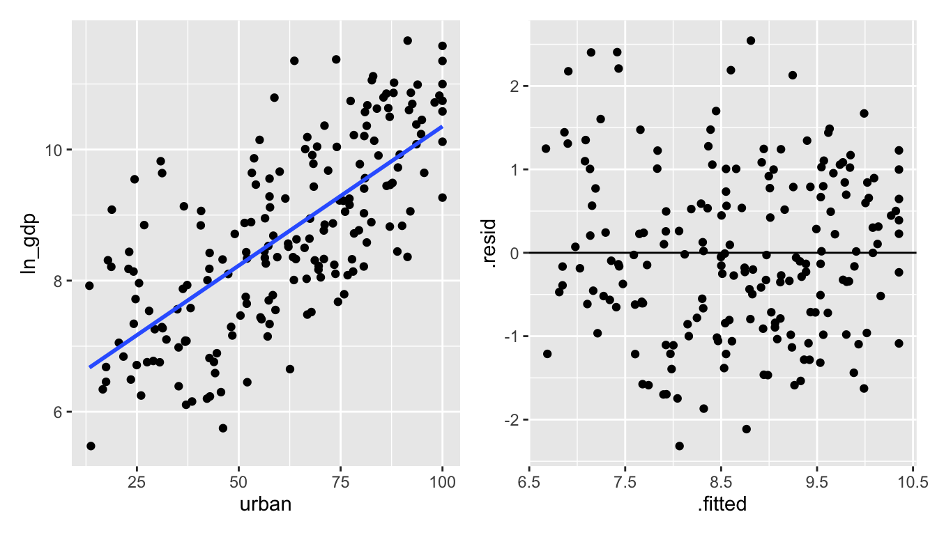
Figure 1.7: urban vs ln(gdp): the natural log of gdp creates a residual plot that seems to follow all of the LINE technical conditions.
The Box-Cox transformations are a class of transformations. Generally, \(\ln, \exp\), square root, and polynomial transformations are sufficient to fit a linear model which satisfies the necessary technical conditions. We won’t spend time learning about Box-Cox, but you can read about them to learn more about transforming variables.
Interpreting Regression Coefficients
Example 1: Transforming \(x\): \(x' = \ln(x)\) \[E[Y] = \beta_0 + \beta_1 \ln(x)\] We can interpret \(\beta_1\) in the following way: for every increase in 1 unit of \(\ln(x)\), \(E[Y]\) increases by \(\beta_1\). Which isn’t a very meaningful statement. Instead, consider \[E[Y| \ln(2x)] - E[Y|\ln(x)] = \beta_1 \ln(2).\] Which can be interpreted as a doubling of \(x\) gives an additive increase of E[Y] of \(\beta_1 \ln(2)\) units.
Example 2: Transforming \(Y\): \(Y' = \ln(Y)\) \[E[\ln(Y)] = \beta_0 + \beta_1 x\] Note also that \[ E[\ln(Y)] = median(\ln(Y))\] because the distribution of \(\ln(Y)\) is symmetric around the regression line.
\[\begin{eqnarray*} median(\ln(Y)) = \beta_0 + \beta_1 x\\ median(Y) = e^{\beta_0} e^{\beta_1 x}\\ \frac{median(Y| x+1)}{median(Y| x)} = e^{\beta_1}\\ \end{eqnarray*}\] An increase in 1 unit of x is associated with a multiplicative change of \(e^{\beta_1}\) in median(\(Y\)). Important to keep in mind that \[\begin{eqnarray*} E[\ln(Y)] \ne \ln(E[Y])\\ median(\ln(Y)) = \ln(median(Y)) \end{eqnarray*}\]
Example 3: Transforming \(x\) and \(Y\): \(x' = \ln(x)\) and \(Y' = \ln(Y)\) \[E[\ln(Y)] = \beta_0 + \beta_1 \ln(x)\] \[\begin{eqnarray*} \frac{median(Y|2x)}{median(Y|x)} &=& \frac{e^{\beta_0 + \beta_1 \ln(2x)}}{e^{\beta_0 + \beta_1 \ln(x)}}\\ &=& e^{\beta_1 (\ln(2x) - \ln(x))}\\ &=& e^{\beta_1 \ln(2)} = 2^{\beta_1} \end{eqnarray*}\] A doubling of \(x\) is associated with a multiplicative change of \(2^{\beta_1}\) in median of Y.
Note that the model regressing GDP on % urban used a log transformation on GDP (the response, or Y variable). As such we know that:
\[\begin{eqnarray*} \widehat{\ln(Y)} &=& \mbox{median}(\ln(Y)) = b_0 + b_1 \cdot x\\ \mbox{median}(Y) &=& \exp(b_0 + b_1 \cdot x) \end{eqnarray*}\]
By using the coefficients which are output from the linear model regressing ln_gdp on urban, we can find a model which predicts the median gdp (not transformed!) as a function of urban.
## # A tibble: 2 × 5
##   term        estimate std.error statistic  p.value
##   <chr>          <dbl>     <dbl>     <dbl>    <dbl>
## 1 (Intercept)   6.11     0.202        30.3 1.18e-74
## 2 urban         0.0425   0.00308      13.8 2.29e-30
\[\begin{eqnarray*} \mbox{median}(\verb;gdp;) &=& \exp(6.11 + 0.0425 \cdot \verb;urban;) \end{eqnarray*}\]
GDP %>%
  ggplot() +
  geom_point(aes(x = urban, y = gdp)) +
  geom_line(aes(x = urban, y = exp(6.11 + 0.0425*urban)), color = "blue")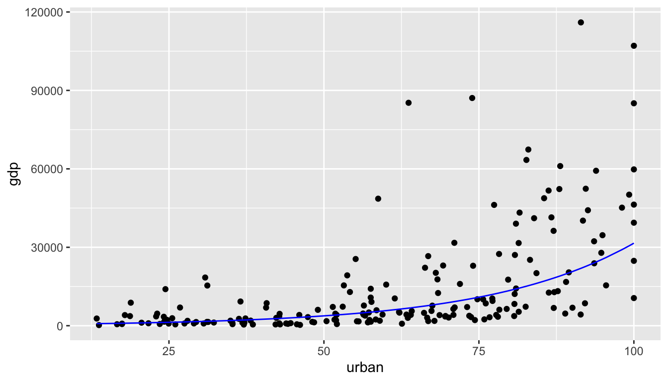
Figure 6.4: The blue exponential line represents the median GDP at a particular value of % urban.
6.5 Reflection Questions
- How do we know if the model conditions hold?
- What do we do if the model conditions don’t hold?
- With a log transformation, how is the slope coefficient interpreted?
- What happens if we want to add lots of explanatory variables to the model?
- How would we add a quadratic term?
6.6 Ethics Considerations
- The GDP model has country as observational unit (192 countries). A quick Google shows that the UN currently defines 193 countries Leaving aside that we might be one short, do the technical conditions need apply if we have the entire population? Can we think of the country data in 2020 as representative of any other (unknown?) population?
- The
mammalsdataset was collected in 1976. Are there reasons why a 50 year old dataset might not represent an accurate model of the population today?
6.7 R: SLR Inference
Consider the mammals dataset in the MASS package (be careful with the MASS, it will overwrite the dplyr functions filter and select) representing the average brain (g) and body (kg) weights for 62 species of land mammals3.
From a first glance at the linear model, it doesn’t seem like there is really any linear relationship at all! And certainly the residuals don’t look like what we’d hoped for the LINE technical conditions.
library(MASS)  # be careful with MASS, it messes up filter and select
data(mammals)

mammals %>%
  ggplot(aes(x = body, y = brain)) +
  geom_point() +
  geom_smooth(method = "lm", se = FALSE)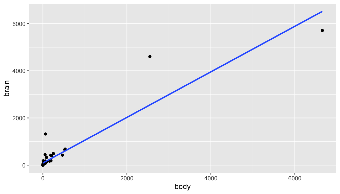
mammals %>%
  lm(brain ~ body, data = .) %>%
  augment() %>%
  ggplot(aes(x = .fitted, y = .resid)) +
  geom_point() +
  geom_hline(yintercept = 0)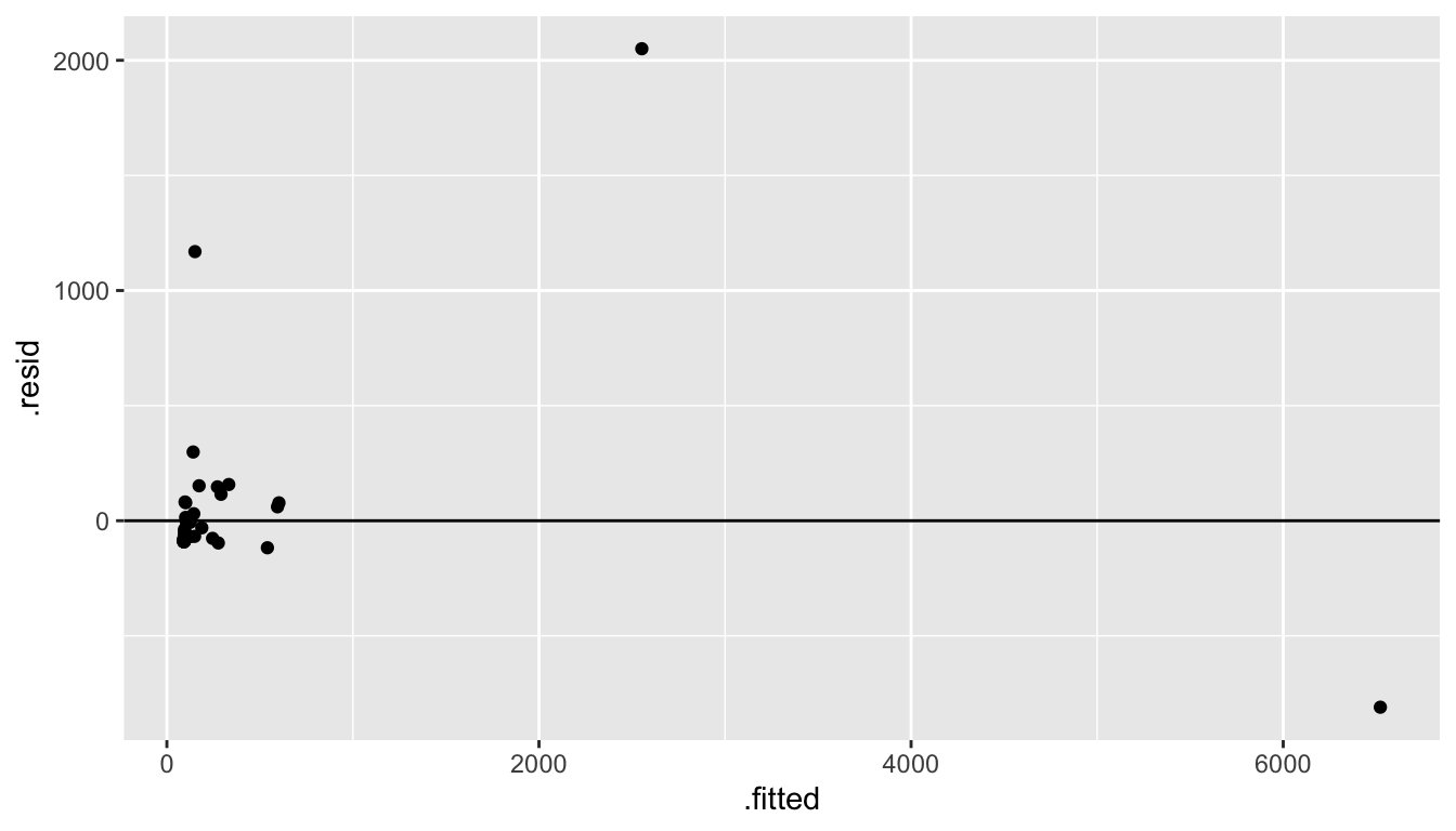
Let’s try some log transformations (square root transformations might also make sense).
mammals <- mammals %>%
  mutate(ln_body = log(body),
         ln_brain = log(brain))

library(patchwork)  # to get the plots next to one another

p1 <- mammals %>%
  ggplot(aes(x = ln_body, y = brain)) +
  geom_point() +
  geom_smooth(method = "lm", se = FALSE)

p2 <- mammals %>%
  lm(brain ~ ln_body, data = .) %>%
  augment() %>%
  ggplot(aes(x = .fitted, y = .resid)) +
  geom_point() +
  geom_hline(yintercept = 0)

p1 + p2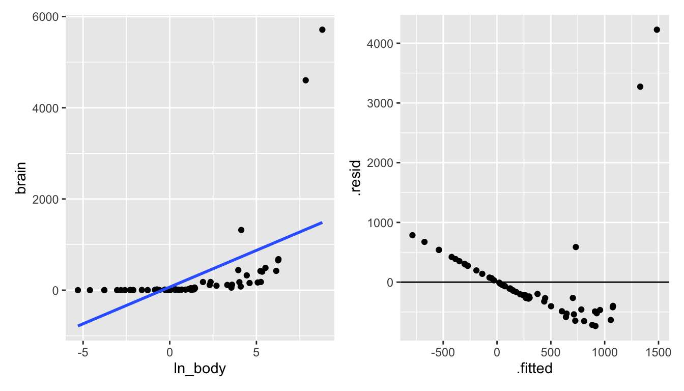
Figure 6.5: Taking the natural log of the body weight doesn’t seem to create a model with a linear shape.
p3 <- mammals %>%
  ggplot(aes(x = body, y = ln_brain)) +
  geom_point() +
  geom_smooth(method = "lm", se = FALSE)

p4 <- mammals %>%
  lm(ln_brain ~ body, data = .) %>%
  augment() %>%
  ggplot(aes(x = .fitted, y = .resid)) +
  geom_point() +
  geom_hline(yintercept = 0)

p3 + p4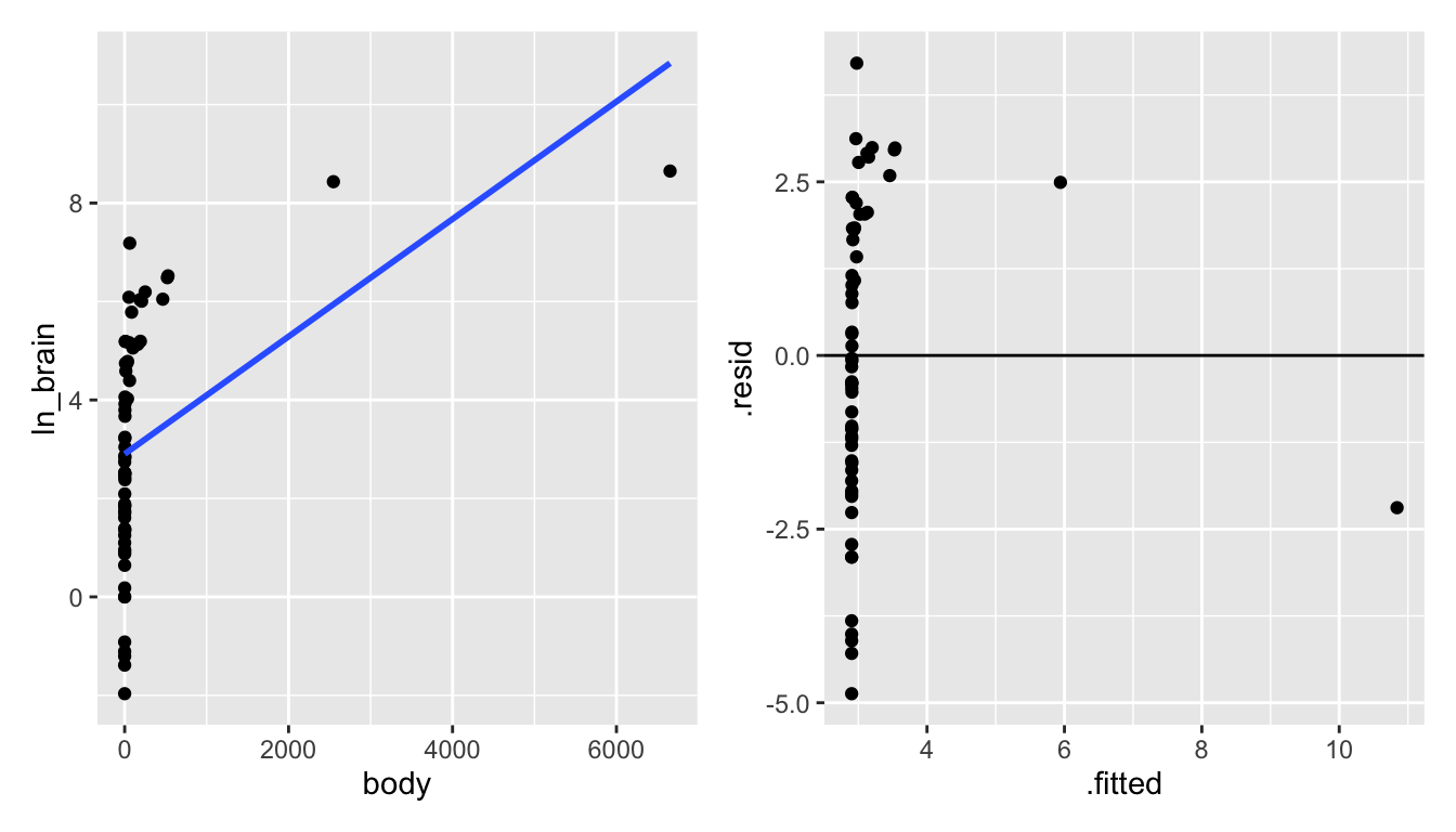
Figure 6.6: Taking the natural log of the brain weight also doesn’t seem to create a model with a linear shape.
p5 <- mammals %>%
  ggplot(aes(x = ln_body, y = ln_brain)) +
  geom_point() +
  geom_smooth(method = "lm", se = FALSE)

p6 <- mammals %>%
  lm(ln_brain ~ ln_body, data = .) %>%
  augment() %>%
  ggplot(aes(x = .fitted, y = .resid)) +
  geom_point() +
  geom_hline(yintercept = 0)

p5 + p6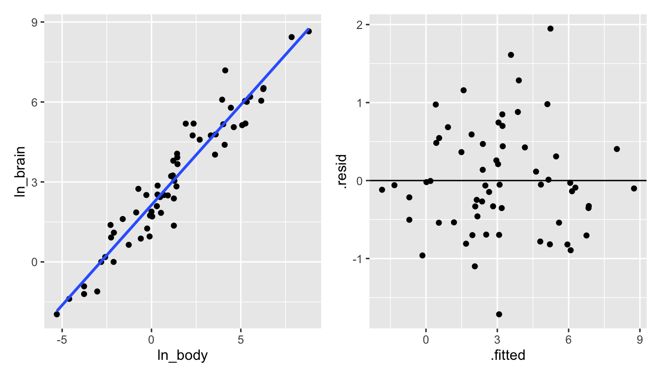
Figure 6.7: Taking the natural log of both the brain and the body weight does seem to create a model with a linear shape!